Customization
Personalize Tree Launcher with themes, colors, fonts, icon packs, backgrounds, and headers.
Themes
Tree Launcher supports light and dark themes:
- Go to Settings → Appearance → Theme Mode
- Choose Light or Dark
For a ready-made look, go to Settings → Appearance → Theme Presets and pick a preset. A preset sets your wallpaper, colors, and other appearance settings in one tap; you can fine-tune any of them afterwards.
Accent Colors
Choose the accent color that appears throughout the app:
- Go to Settings → Appearance → Accent Color
- Pick a swatch from the palette
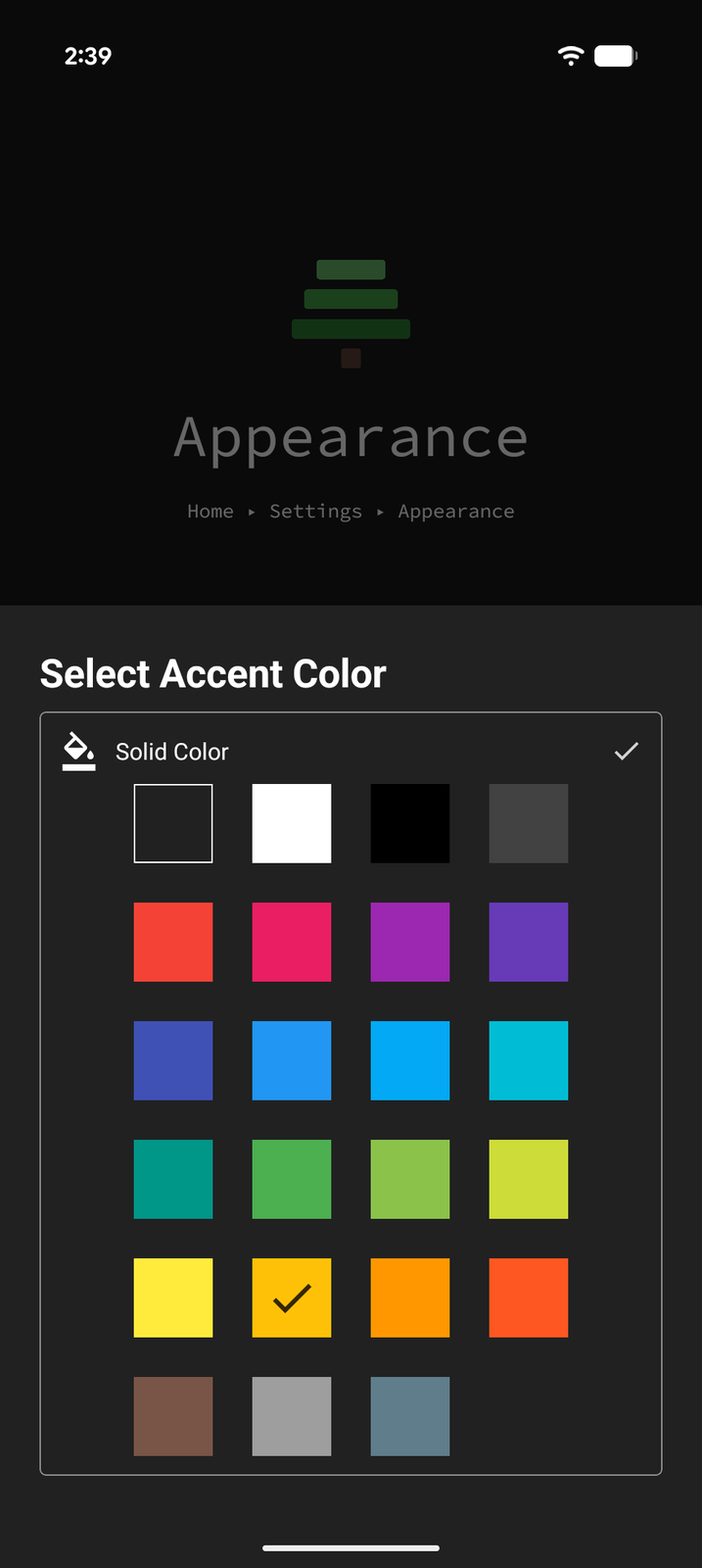
The accent color is used for highlights, active states, and interactive elements across the app.
Backgrounds
Global Background
Tree Launcher draws your pages over your device wallpaper, so the global background is the wallpaper itself:
- Go to Settings → Appearance → Background
- Choose a solid color, or pick an image as your wallpaper
Per-Page Background Color
Give an individual page its own background color:
- Open the page and enter Edit Mode
- With no item focused, tap Background in the edit toolbar
- Choose a color for that page
Page backgrounds are colors only — images are set globally through the wallpaper.
Background Overlay
A background overlay is a tint layer placed on top of your wallpaper. Use it to lighten, darken, or color-shift the background so your page content stays easy to read.
- Go to Settings → Appearance → Background Overlay
- Pick an overlay color and adjust its strength with the opacity slider
The overlay applies to every page. It works in tandem with an image wallpaper — for example, darkening a bright photo so light text stays legible, or adding a subtle color wash to match your theme.
Icons
App Icon Packs
App icons come from your device by default, or from any icon pack installed from the Play Store:
- Go to Settings → Appearance → Apps Icon Pack
- Choose System Icons or one of your installed icon packs
Adaptive Icons
Give app icons a uniform shape and background:
- Adaptive Icons (Settings → Appearance → Adaptive Icons) — choose None, Circle, Squircle, Rounded Square, or System to follow your device's shape
- Icon Background — with adaptive icons on, pick a background color to draw a monochrome icon over a tile of that color, or leave it empty to keep each app's own background
Custom Item Icons
You can also override icons on individual items:
- Focus an item in Edit Mode
- Open item options
- Tap Icon
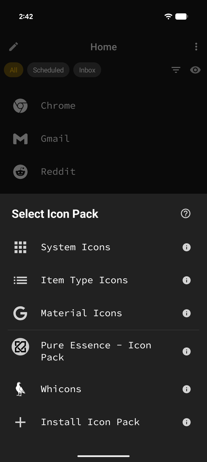
- Choose an icon from System Icons, Item Type Icons, Material Icons, or any installed icon pack
Per-Item Colors
Color individual items for visual organization:
- Focus an item in Edit Mode
- Open item options
- Tap Color
- Choose a background color for that item
This is great for color-coding categories, priorities, or simply making key items stand out.
Home Header
The home page has a customizable header area. All of its settings live in one sheet: go to Settings → Home Screen → Home Header, make your changes, and tap Save.
Clock Display
By default, the header shows a clock. Use the Clock row to choose 12hr Clock (with AM/PM), 12hr Clock (no AM/PM), or 24hr Clock, and the Show date switch to show or hide the date.
Header Height
Choose how much of the screen the header takes up: - Compact (25%) - Standard (the default) - Tall (50%) - Full Screen (100%)
Layout and Text
The same sheet also lets you set the header's vertical and horizontal alignment, choose a separate header Font, adjust the Title size and Subtitle size (S / M / L / XL), and turn on Header-only mode, which hides the list until you scroll the header up.
Widget Stack Header (Pro)
Turn on the Widget Stack header switch to replace the clock with a scrollable stack of Android widgets. See Pro Features.
Weather on Header (Pro)
Display current weather information in the home header. See Weather.
Font Selection (Pro)
Choose from 97 font families to customize the look of all text in Tree Launcher. See Pro Features.
Font Size
Adjust the text size across the app — Small, Medium, or Large — in Settings → Appearance → Font Size. This is free for everyone, and works together with your device's system font size.
Icon Size (Pro)
Adjust the icon size across the app — Small, Medium, or Large. Free users are locked to Medium. See Pro Features.