In this article
- Quick methods: the tools already on your phone
- Step 1: Audit your current setup
- Step 2: Identify your daily drivers
- Step 3: Remove the temptation apps
- Step 4: Think in contexts, not apps
- Step 5: Reduce visual noise
- Step 6: Build a capture system
- Step 7: Review and iterate
- Before and after: a worked example
- Putting it all together
- Frequently asked questions
Your home screen is the first thing you see every time you pick up your phone. If it is cluttered, chaotic, or filled with attention-grabbing icons, every unlock starts with a small cognitive tax. Over dozens of daily unlocks, that adds up to a real drain on your focus.
The good news: a few intentional changes can meaningfully improve how you use your phone. This guide starts with the standard tools every Android phone already has, with the exact menu paths for Pixel and Samsung, then walks through a seven-step method that works with any launcher. At the end it shows what becomes possible when the launcher itself is designed around organization.
Quick methods: the tools already on your phone
Before any method, know your options. Every Android launcher can do these four things, and they fix most of the clutter on their own.
Make a folder
Drag one app icon onto another. Android creates a folder containing both. Tap the folder, then tap its name to rename it. This works the same way on Pixel, Samsung and almost every other launcher.
Hide apps you never open
- Samsung: Long-press an empty area of the home screen, tap Settings, then Hide apps on Home and Apps screens. Pick the apps and tap Done. They stay installed and still appear in search.
- Pixel: The Pixel Launcher cannot hide apps. Instead, long-press an icon on the home screen and tap Remove. The app stays in the drawer. To really hide something, you need a third-party launcher, or you can disable preinstalled apps under Settings → Apps.
Change the grid size
- Pixel: Long-press an empty area, tap Wallpaper & style, then App grid. A larger grid, such as 5×5, fits more per screen; a smaller one leaves breathing room.
- Samsung: Long-press an empty area, tap Settings, then Home screen grid or Apps screen grid.
Add or remove widgets
Long-press an empty area and tap Widgets on either phone. To remove one, long-press it and drag to Remove at the top. The useful test for a widget is whether you read it without tapping. If you do not, it is decoration.
Turn off notification badges
- Pixel: Settings → Notifications → Notification dot on app icon, off.
- Samsung: Settings → Notifications → Advanced settings → App icon badges, off, or per app under each app's notification settings.
Those are the tools. The rest of this guide is how to use them with intent.
Step 1: Audit your current setup
Before changing anything, take stock. How many apps are on your home screen right now? How many do you actually use daily? If you are like most people, you have 30 to 60 app icons visible, and you regularly use maybe 8 to 10 of them. The rest are visual noise, and every icon is a tiny decision your brain has to ignore.
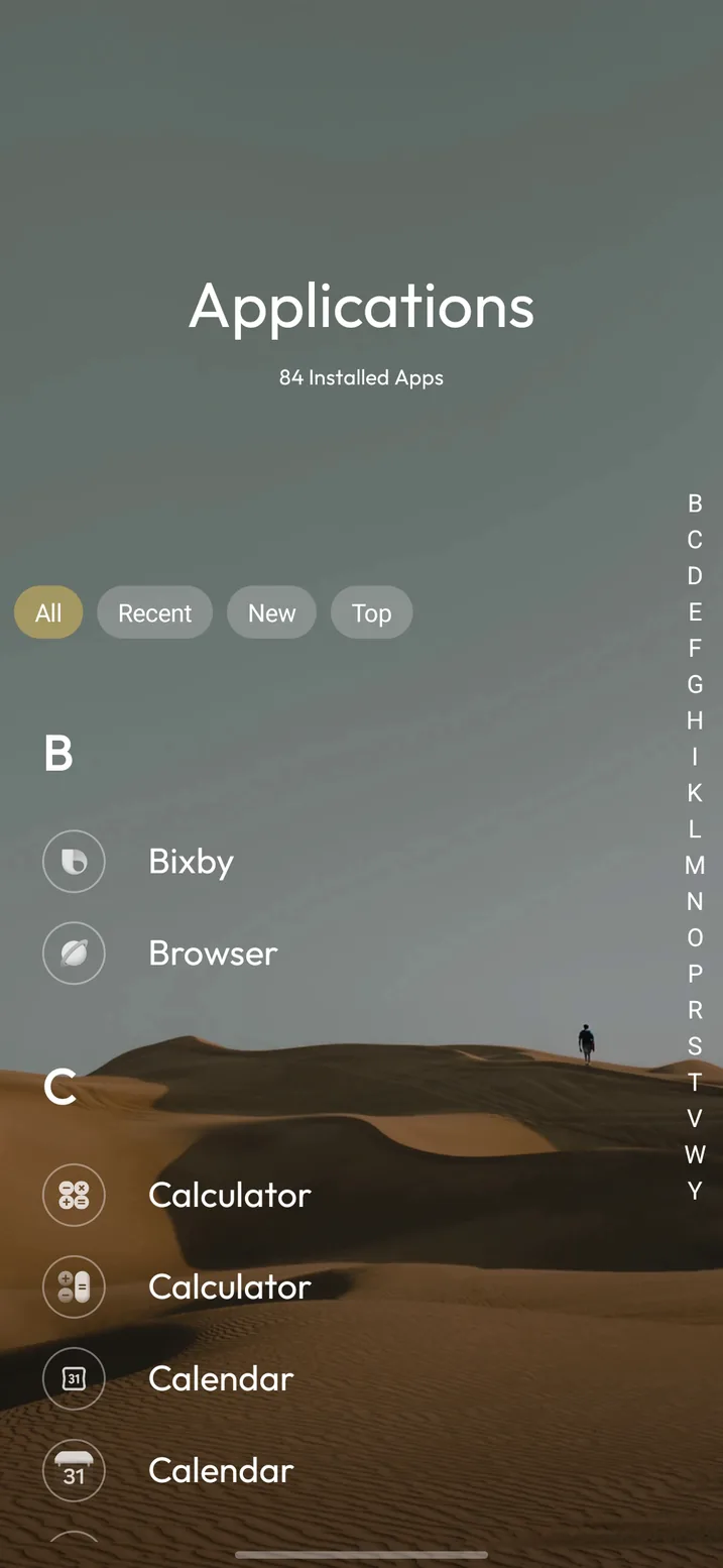
Open your app drawer and scroll it end to end. That is the real inventory. Then go through your home screen and honestly ask of each icon: when was the last time I tapped this? If the answer is "I can't remember," it does not deserve prime real estate.
Step 2: Identify your daily drivers
Write down the apps you actually use every day. Not the ones you think you should use, the ones you actually open. For most people this list is surprisingly short: a messaging app, email, browser, camera, maybe a music or podcast app, maps, and your calendar. That is 7 to 10 apps, not 50.
Android keeps the receipts if you want them. Settings → Digital Wellbeing & parental controls shows how often you opened each app this week. The list is usually humbling, and it is a better guide than memory.
These are the only apps that deserve instant, one-tap access. Everything else can live one level deeper, in a folder, the app drawer, or a second page.
Step 3: Remove the temptation apps
Some apps are designed to pull you in. Social media, news feeds, video platforms, games: their icons are literally designed by teams of people whose job is to make you tap. Removing these from your home screen does not mean uninstalling them. It means adding one small step of friction between you and the dopamine loop.
Move them to a folder, a secondary page, or just the app drawer, and turn off their badges using the paths above. That extra second of intentionality, having to search or navigate to the app, is often enough to break the reflexive open-and-scroll habit. If it is not, Digital Wellbeing's per-app timers add a hard stop.
Step 4: Think in contexts, not apps
This is where most home screen organization advice stops: "put your important apps on the first page and everything else in folders." That is fine, but it misses a more powerful organizing principle.
Instead of thinking about individual apps, think about the contexts you operate in. You have a "work" context, a "personal" context, maybe a "health" context, a "finances" context, a "creative projects" context. Each context involves a different set of apps, and often a different set of information: tasks, notes, reference links.
The most productive home screens are organized around what you do, not what you have installed.
With most launchers, you can approximate this with folders: a "Work" folder with Slack, email, calendar and Drive; a "Health" folder with your fitness tracker and meal planner. But folders are limited. They can only contain apps, and they are all one level deep.
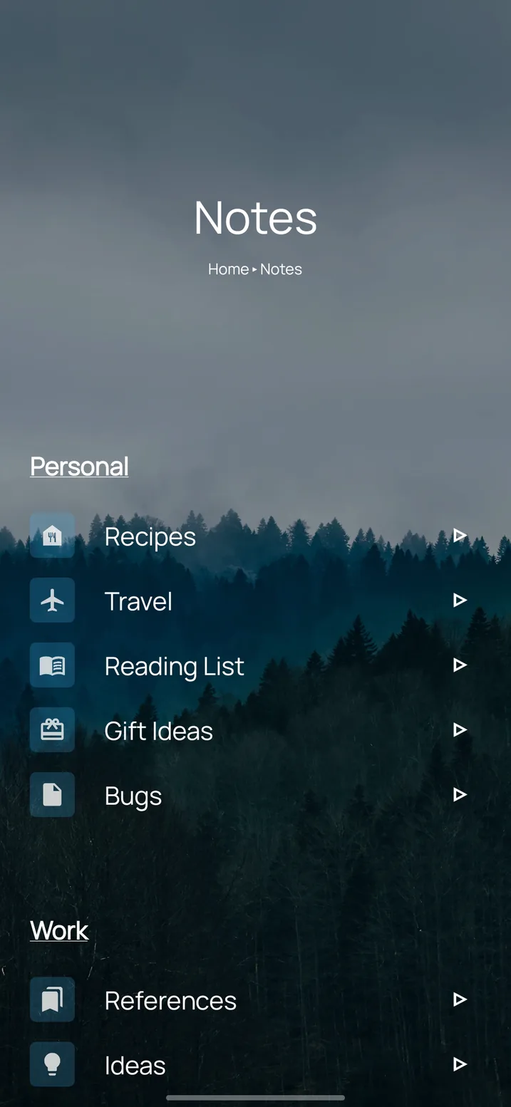
Going further with Tree Launcher: This is exactly the problem Tree Launcher was built to solve. Instead of folders, you create pages for each context, and those pages can contain not just apps, but also tasks, notes, links and sub-pages. Your "Work" page might have your work apps at the top, today's task list in the middle, and sub-pages for each project. Everything for that context, in one place.
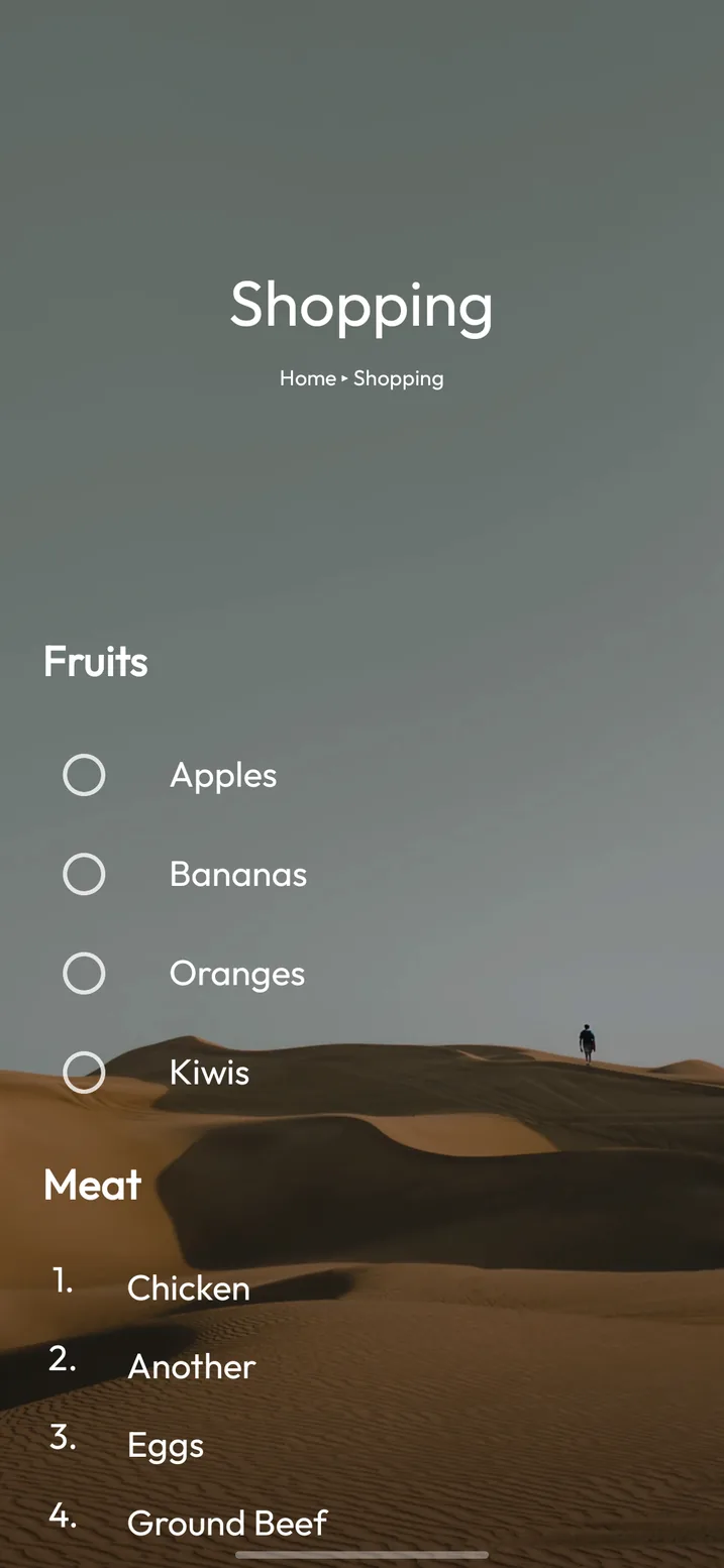
A context page does not have to be abstract. A shopping list page holds the grocery list itself, grouped by aisle, with the store's app one tap above it.
Step 5: Reduce visual noise
Every color, icon, badge and widget on your screen competes for attention. A few targeted reductions can make your home screen feel dramatically calmer:
- Turn off notification badges on apps where the count does not matter. You do not need to know you have 47 unread promotional emails.
- Use a neutral wallpaper. A busy photo or bright pattern adds visual complexity. Solid colors or subtle gradients create calm.
- Consider a dark theme. Dark backgrounds with light text feel less demanding and use less battery on OLED screens.
- Reduce widget clutter. One or two useful widgets (calendar, weather) are great. Five widgets stacked on top of each other defeat the purpose.
- Try a text-only layout. Several launchers, Tree Launcher included, can show app names without icons at all. It is the single biggest noise reduction available, and the minimalist launcher guide compares the options.
Step 6: Build a capture system
One of the biggest productivity drains is the moment when you think of something (a task, an idea, a link to save) and have to figure out where to put it. Without a system, you either forget it or spend two minutes navigating to the right app.
Build a quick-capture habit. This could be a notes widget on your home screen, a dedicated "inbox" in your task manager, or, if you are using Tree Launcher, the built-in inbox that lets you dump items instantly and sort them later. Anything shared to Tree Launcher from another app lands there too.
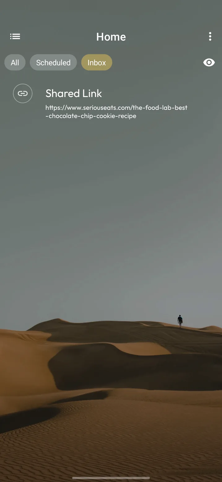
The key is that capture should be frictionless. One tap, type or paste, done. Organizing happens later, during a deliberate review, not in the frantic moment when the idea hits.
Step 7: Review and iterate
Your home screen is not a one-time project. Your needs change: new projects start, seasons shift, priorities evolve. Set a monthly reminder to spend five minutes reviewing your setup. Ask yourself: what am I reaching for that is hard to find? What is on my home screen that I never use? Is my organization still reflecting how I am actually working?
A scheduled view helps here. If your reminders and events live on the home screen, the weekly review is just a scroll.
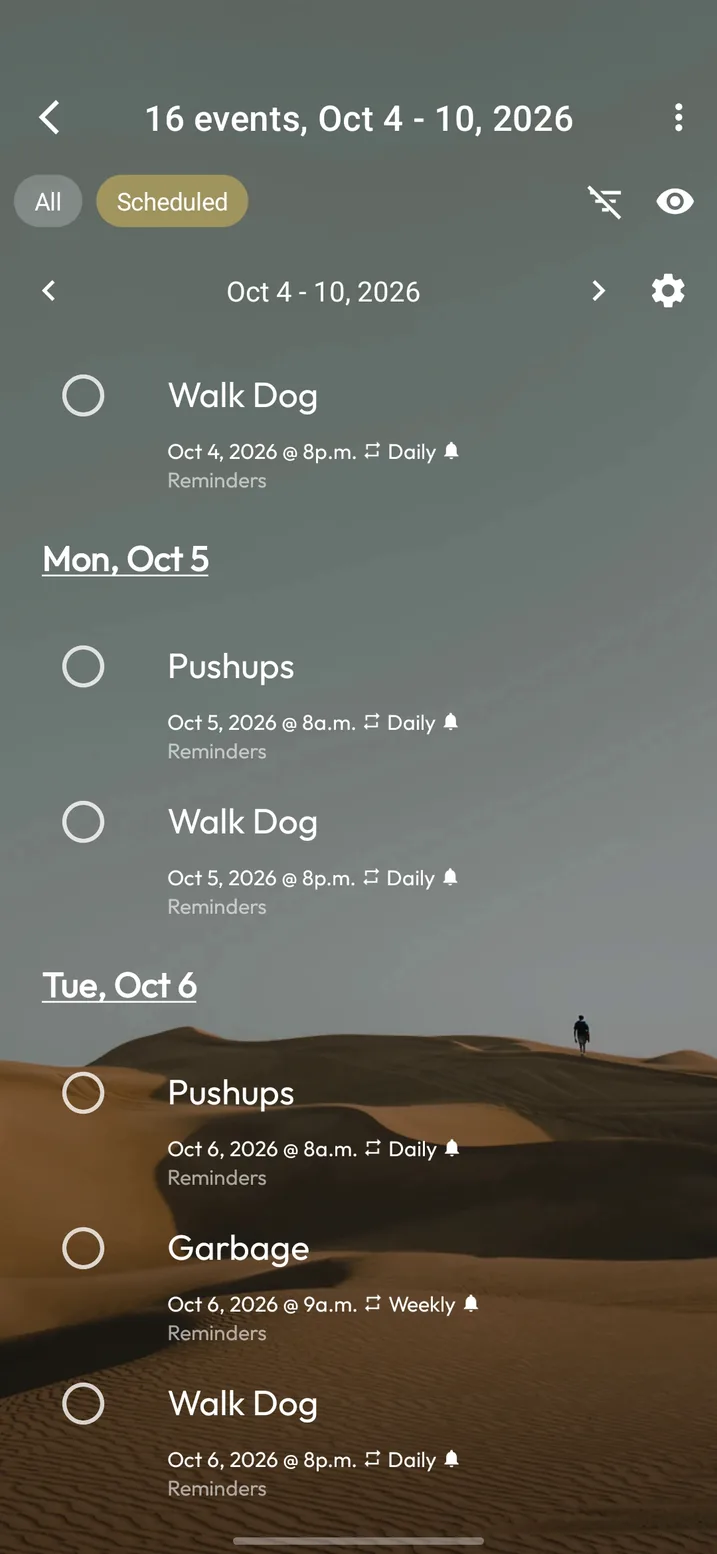
The best home screen is one that evolves with you rather than one that was "perfect" six months ago and has not been touched since.
Before and after: a worked example
Here is what the method looks like applied to a typical phone: the kind of setup most people arrive with, and where the seven steps leave it.
Before. Three home screen pages. Fifty-four icons, roughly in install order. Two weather widgets from different apps. Badges on everything. Instagram, Reddit and YouTube on the first page, because that is where they were put the day they were installed. Grocery lists in one app, work tasks in another, a "read later" pile in a third, and no idea which app held which.
After. One screen. Eight apps: messages, email, browser, camera, maps, calendar, music and a notes app. Four context folders: Work, Home, Health, Money. Social apps in the drawer with badges off. One widget, the calendar. A quick-capture shortcut pinned in the dock.
That is a huge improvement, and for a lot of people it is enough. What it still cannot do is put the grocery list inside the Home folder, or today's three work tasks inside Work. The folders hold apps and nothing else, so the information still lives in six different places.
That gap is why Tree Launcher exists. The same layout, rebuilt as pages: a Home page with the grocery list under the store app, a Work page with the task list under the work apps, a Health page with the workout plan next to the fitness tracker. Same eight apps on top. Everything else one swipe down, exactly where you would look for it.
Putting it all together
A productive home screen follows a few simple principles: only essential apps get prime placement; everything is organized by context rather than alphabetically or by install date; visual noise is minimized; there is a fast way to capture ideas; and the whole setup gets reviewed regularly.
These principles work with any launcher, using nothing but the folder, hide and widget tools at the top of this guide. But if you want to push them further, organizing by context with real depth, mixing apps with tasks and notes, building a hierarchy that mirrors your life, that is where a purpose-built tool makes a difference. If you are new to switching launchers, this primer covers how it works and how to switch back.
Frequently asked questions
How many apps should be on my home screen?
Fewer than you think. Most people open eight to twelve apps on a typical day, and those are the only ones that earn a spot on the first screen. Everything else belongs one tap away in a folder, a page or the app drawer. If you cannot name the last time you opened an app, it should not be on your home screen.
Should I use folders or multiple home screen pages?
Folders, for most people. A folder keeps related apps together without the swiping that extra pages require, and you can name it after a context like Work or Health. Extra pages make sense for a widget-heavy layout, or in a launcher like Tree Launcher where a page can hold notes and tasks as well as apps.
How do I stop opening social media apps reflexively?
Remove the icon from your home screen and turn off its notification badge. You are not uninstalling anything; you are adding two seconds of friction, which is usually enough to turn a reflex into a decision. If that is not enough, set a daily timer in Android's Digital Wellbeing settings.
Is it better to just use the app drawer and keep the home screen empty?
It works for some people, especially with a search-first launcher. The trade-off is that every app becomes a search, including the ones you open twenty times a day. A small set of daily apps on the home screen plus the drawer for everything else is faster for most people.
Organize your home screen like your brain
Tree Launcher lets you build a hierarchy of pages with apps, notes, tasks and more. Free on Google Play.
Get Tree Launcher